What Makes a Good Metric? Three Tests Most Dashboards Fail
Lorem ipsum dolor sit amet, consectetur adipiscing elit. Suspendisse varius enim in eros elementum tristique. Duis cursus, mi quis viverra ornare, eros dolor interdum nulla, ut commodo diam libero vitae erat. Aenean faucibus nibh et justo cursus id rutrum lorem imperdiet. Nunc ut sem vitae risus tristique posuere.

The dashboard is green. Every KPI hits its target, and the quarterly review ends early because nobody has any questions. Three months later, the customers those numbers were supposed to represent have churned.
Everyone knows the advice: measure what matters, as John Doerr put it. But few people explain what makes a good metric, which is how teams end up tracking the wrong ones. Our earlier piece on business acumen for data teams referred to metric development as both an art and a science. This is the science half.
What Makes a Good Metric?
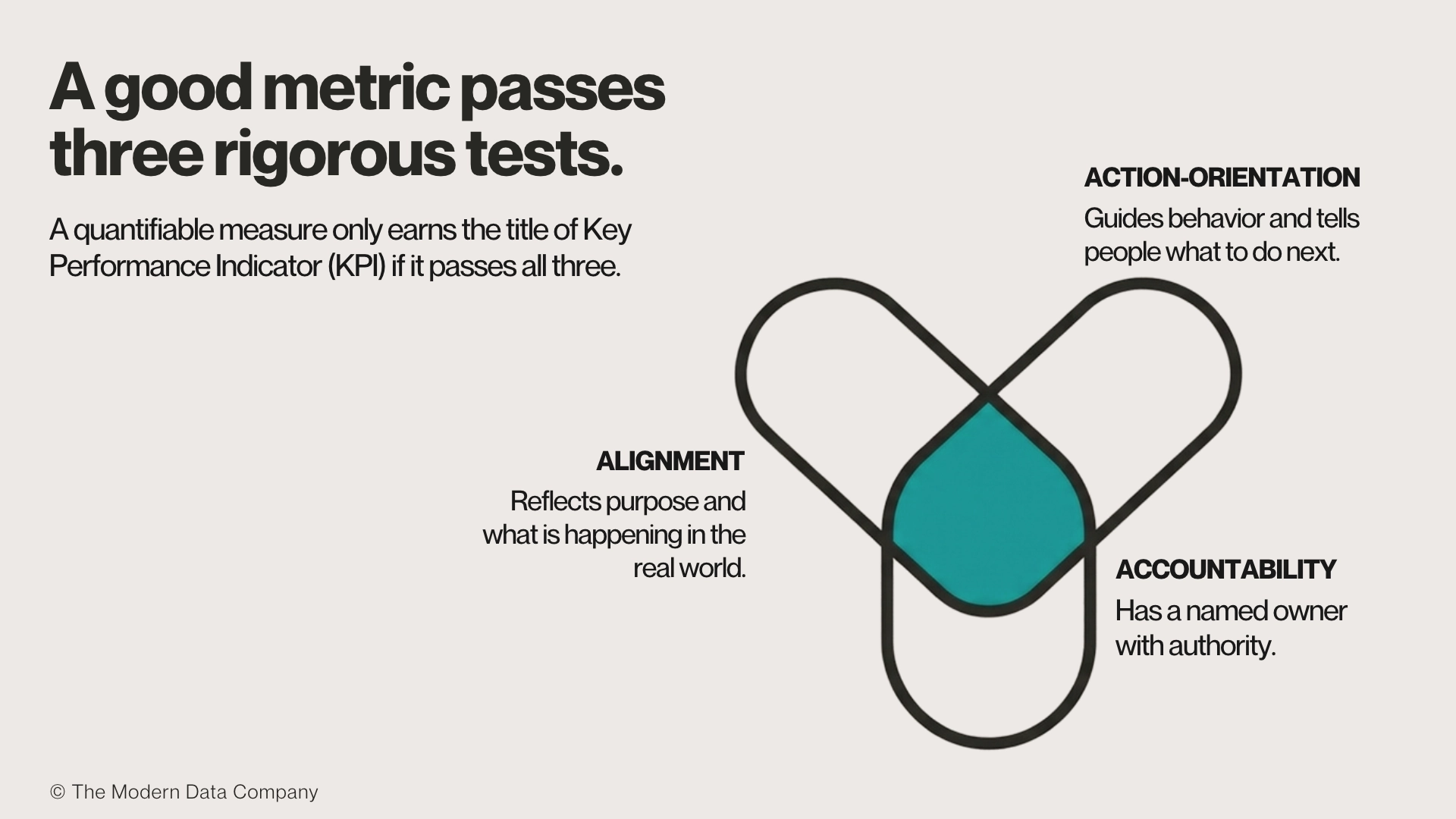
A good metric is a measure that reflects an organization’s purpose, tells people what to do next, and has a named owner. Three tests cover most of the ground: alignment, action-orientation, and accountability. A key performance indicator (KPI), the quantifiable measure an organization uses to judge progress against its goals, only earns the label if it passes all three.
Alignment
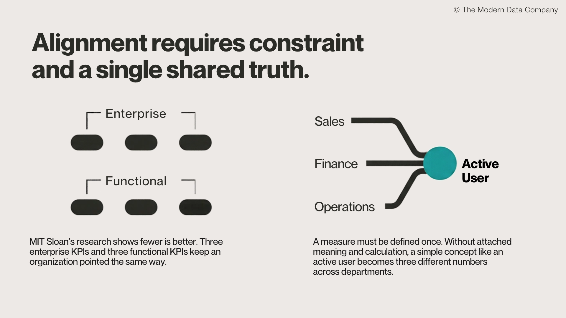
Alignment means four things. First, a good metric tracks something valuable to the business. Second, it reflects what is happening in the real world. Third, it means there are few metrics, because aligning many metrics is unwieldy. MIT Sloan’s research on KPI use finds that fewer is generally better, with three enterprise KPIs and three functional KPIs usually enough to keep an organization pointed the same way.
Finally, alignment also means one definition, shared across teams. A measure defined once, with its calculation and meaning attached, prevents two consumers from computing the same metric two different ways. Without that, something as basic as an “active user” becomes three different numbers in Sales, Finance, and Operations.
Action-Orientation
Action-orientation means the metric guides behavior. It can be improved through effort, it arrives in time to fix today’s problem rather than explain last month’s, and it agrees with what people on the ground are saying.
Jeff Bezos saw complaints that his customers were waiting on hold too long. His team showed him a report with waits under a minute. So he called customer support mid-meeting, and it took ten minutes to connect. His rule of thumb is that when data and anecdotes disagree, the anecdotes are usually right. The usual culprit is not miscollected data but measuring the wrong thing.
Accountability
Accountability means every good metric has someone who owns it. John Wernfeldt argues that a metric is not a technical artifact but a decision artifact, and that someone must have the authority to define it, approve changes to it, and answer for it when it is wrong or when performance slumps. Put another way, it must be right, and it must be improving. Widespread usage is not the same as individual ownership.
What About Goodhart’s Law?
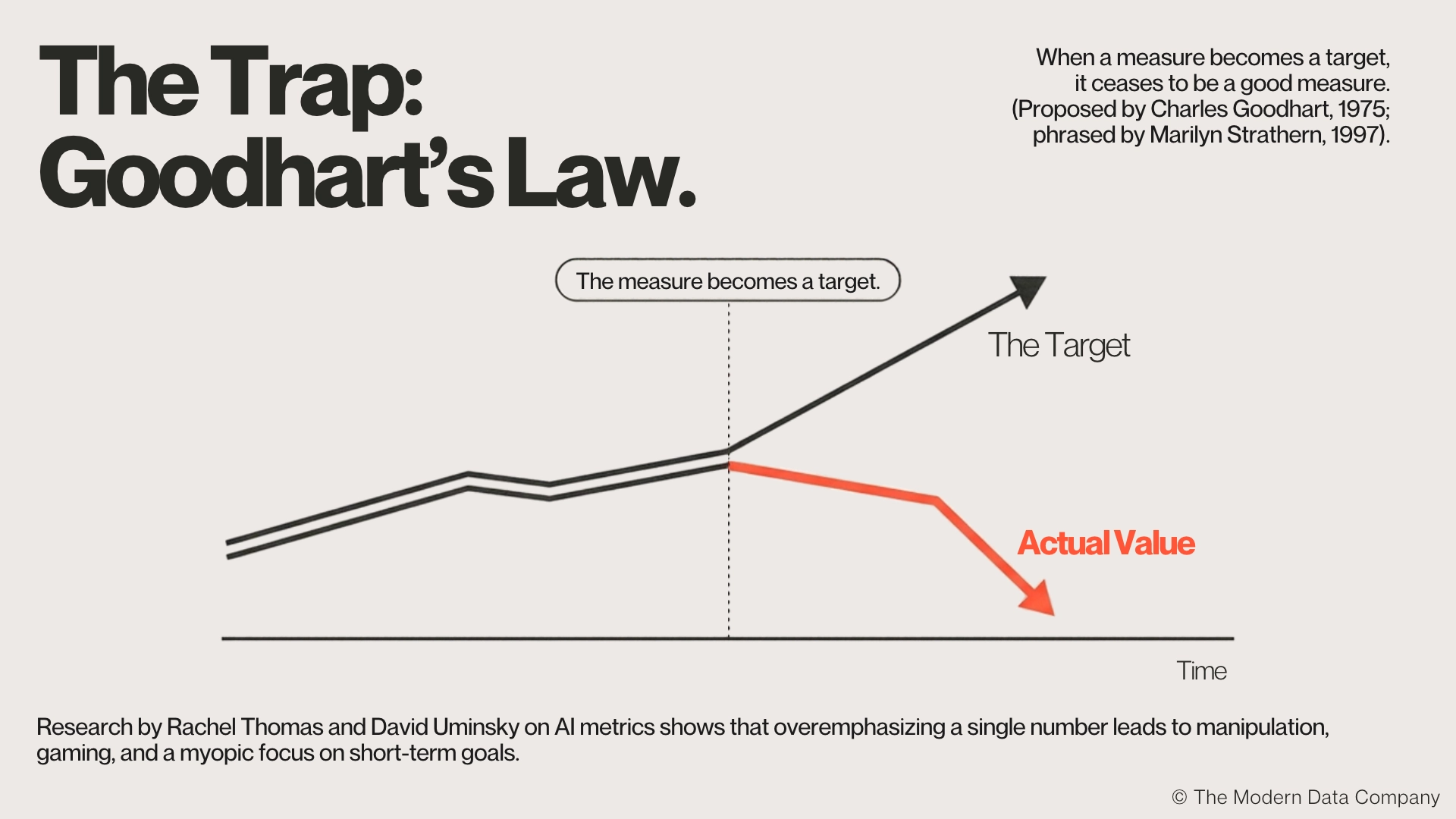
Goodhart’s Law is the observation that when a measure becomes a target, it ceases to be a good measure. Economist Charles Goodhart first proposed the idea in 1975 after monetary metrics broke down once central banks adopted them as targets, and the popular phrasing is usually credited to Marilyn Strathern in 1997.
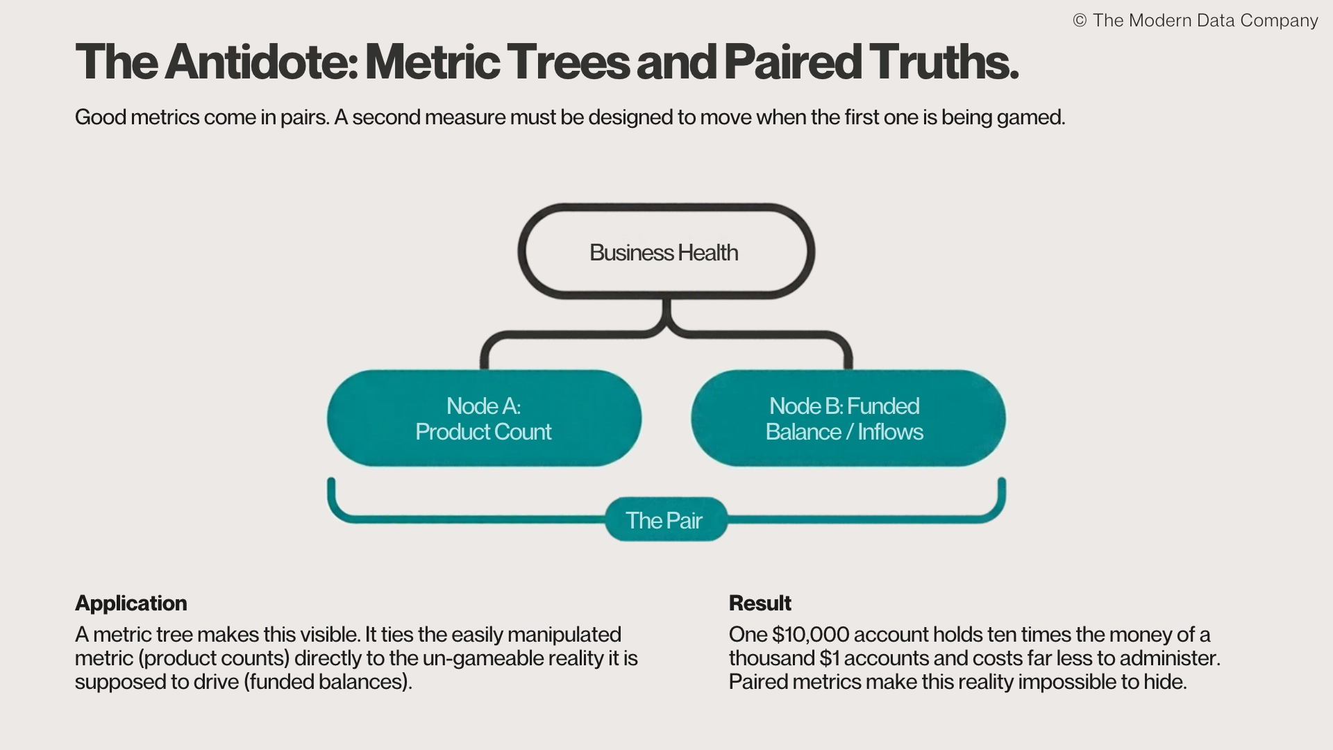
Rachel Thomas and David Uminsky’s research on metrics in AI finds that overemphasizing a metric leads to manipulation, gaming, and a myopic focus on short-term goals. Their remedy is a slate of metrics rather than a single number, combined with qualitative accounts. That is why good metrics come in pairs: a second measure that moves when the first one is being gamed.
Good Metric vs. Bad Metric: What’s the Difference?
The three tests break down into more specific traits. This is how a good metric and a bad one behave in practice.
How Did Wells Fargo’s Cross-Sell Metric Go Wrong?
Wells Fargo's fraudulent account opening scandal shows what happens when a metric hardens into a target. The bank’s goal was to increase cross-sell ratio, with a target of eight products per customer. Employees under pressure to meet unrealistic sales targets opened an estimated 3.5 million unauthorized accounts, and total payouts to regulators and in settlements exceeded $3 billion.
No single metric caused that scandal. A decade of aggressive targets and failures of leadership did. But products per household is a reasonable measure of relationship depth and a poor measure of what keeps a bank in business, which is money it can lend and invest. An account opened and then funded by moving money from another account at the same bank adds a product and no new money.
A compensating metric would have exposed the gap. The time between opening an account and funding it flags accounts created but never onboarded. Total inflows per household, or the dollar value of each account, flags the case where product count rises, and value does not. One $10,000 account holds ten times the money of a thousand $1 accounts and costs far less to administer.
A metric tree makes that pairing visible by tying product counts to the funded balances and revenue they are supposed to drive. Would paired metrics have prevented the scandal? Hard to say, and no pair of numbers undoes a decade of pressure. But the right metrics encourage the right behavior, and investors and employees might have pushed for accountability sooner if they had seen product counts climbing while value per household stayed flat.
How DataOS Enforces Alignment of Metrics with Business Goals
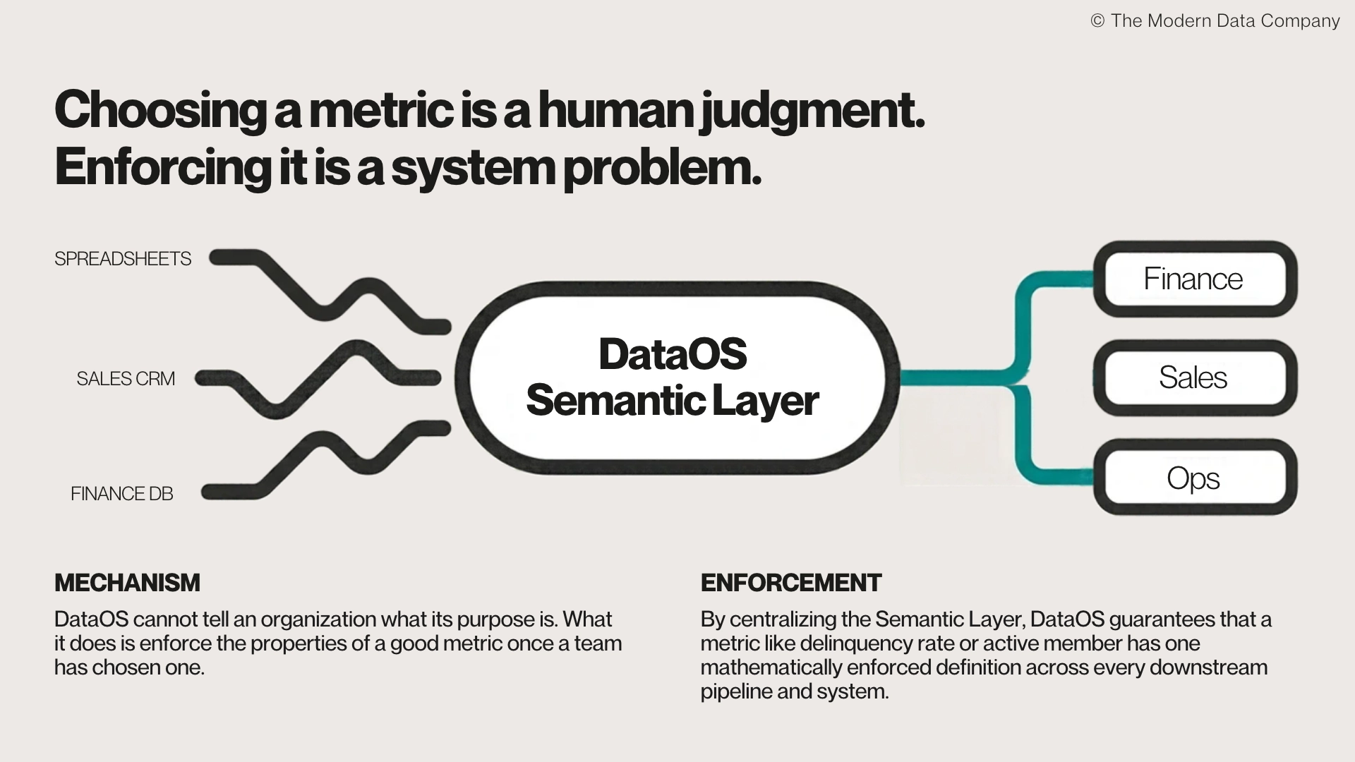
Choosing the right metric requires human judgment about purpose. DataOS cannot tell an organization what it exists to do. What it can do is enforce the properties of a good metric once a team has chosen one, starting with trust. Every data product carries its own semantic layer, so a metric has one definition that Sales, Finance, and Operations all read the same way.
In financial services, that means centralizing what “delinquency rate” or “active member” means and enforcing it across every downstream system, instead of letting each pipeline or spreadsheet carry its own version. Each data product also exposes its definition, lineage, governance policy, and freshness guarantee alongside the data, so anyone can inspect the inputs, and a stale number fails visibly instead of silently.
That covers the trust and timing rows of the table. Ownership still needs a person with the authority to say what a metric means and when it can change. A platform makes that authority visible and enforceable. It cannot appoint it.
How to Audit Your Metrics
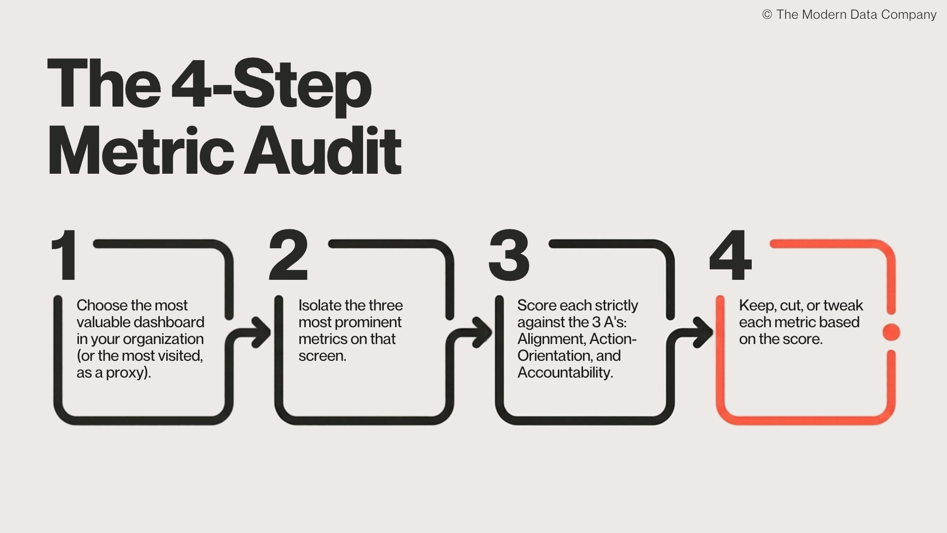
The fastest way to apply these tests is a small audit.
- Choose the most valuable dashboard in your organization.
- Pick the three most prominent metrics on it.
- Score each against alignment, action-orientation, and accountability.
- Keep, cut, or tweak each metric based on the score.
The metrics that survive are the ones worth defending in a review. The ones that fail were already making decisions for you, only badly.